-

Globaldesi is a boho-chic brand with global appeal. For their foray into the international market, we redesigned the identity to enhance the boldness of the brand's world. Beginning with the introduction of a "cocky" monogram, that imitates a strutting peacock, we created a gender-neutral, fast fashion, colour palette. And a tagline that encourages an unabashed expression of personal style.
-

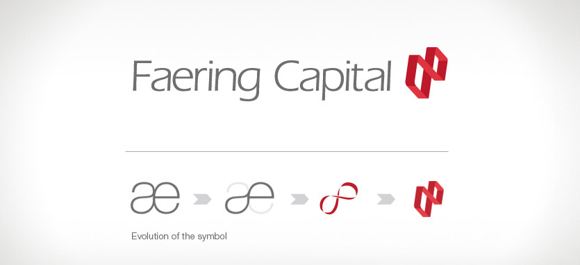
Faering Capital
A young private equity fund that proposes to manage old money needs a fresh look that stands out from the pack. We proposed the name "Faering Capital". A faering is a Nordic boat used for scouting purposes. Red is bold, dependable and unconventional, and it stands out from the sea of blue logos that are a staple in finance. -

Tote on the Turf
With sprawling al fresco dining, an exclusive bar and restaurant and a unique and versatile event space, Tote presented tremendous opportunities to explore its location within the historic Mahalaxmi Race Course. The logo draws from the building's original function as the Totalisator office and combines it with a sense of contemporary urban luxury. -

Turning Point
Turning Point wines are specially created for a young, no fuss wine drinker, they encourage you to savour every moment. The identity had to be bold and contemporary, and speak in the language of young, urban India. -

Medanta
In a critical facility targeted both to the urban middle class Indian and to rural audiences, signage with clarity can be a matter of life and death. The aim was to create a non-alienating, bi-lingual system. The name Medanta was derived from Medicine + Vedanta-an ancient Indian science. The symbol represents a convergence of various medical facilities under one roof. Coral, a stone and colour of healing, was chosen with a soft grey to symbolise the Medanta brand. -

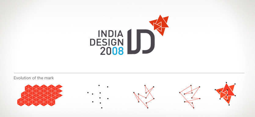
India Design 08
For a global design event of Indian origin - we chose to represent India Design through a dynamic identity. The logo began with a triangle, the ancient symbol of energy and vitality in India. A configuration of these triangles was created, broken and reconstructed to form the main symbol which was used in various avatars across different media. -

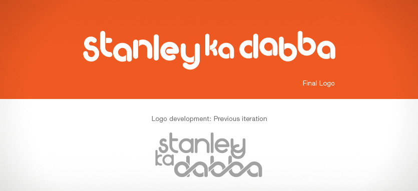
Stanley ka dabba
A little story with a big heart. No one really knows why Stanley never brings his "dabba" or tiffin to school for lunch. We wanted to communicate how people are intrinsically connected, and in the film, food plays a major part in bringing people together. The logo is rounded and jovial-the "dabba" encourages you to share and look at the lighter side of life. -

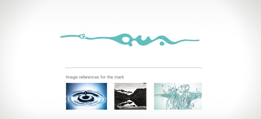
Qua
We were approached to develop a premium brand of bottled water. An extensive proposal was put together along with recommendations for the name of the brand. The name 'Qua' is derived from Aqua, meaning water. A number of design directions were explored, inspired by water in all its forms. -
 Animania
A show and collection on the Sacred Animals of India interpreted by graphic artists from across the globe. The aim was to re awaken our love for animals by reminding people how they were revered and protected in ancient India. Instead of referencing the historicity of the subject, we chose to play on the whimsical side that animals bring out in all of us.
-

India 9 - 5
For India 9 to 5, an urban snapshot of life across social and economic strata in India's cities, we took the iconic chakra symbol and modernised it, keeping its ideology intact but reflecting the new urban outlook of India, after 62 years of independence.